
Twilight

Twilight
The ink is branded as a blue-black ink. I remember using a bottle of this colour many years ago it was a dark blue-black with a tingle of dark green/grey. But I recently purchased another bottle ink is so close to a black. I have looked at other reviews of the ink and the colour range from a grey/black/blue to a grey/black. So I am having a hard time deciding on this ink right now.
I like the rich colour but despite how it may look when you use it, I double it will every look like the colour used to create the label.
Writing performance is very good. There i bit of delay for the to dry, close to 10 seconds depending on the width of the nib.I do not have a lot of shading in the bottle I have been using. I have seen others write with the ink that is a grey-blue and shadowing is prominent.
I saw quite a variation of colour when viewing other reviews of the ink.
Blue-Black

Blue-Black
I like the flate tone of the ink. Beauty in simplicity. No complicated and messy sheen of other colours. There is blue and plenty of black in this ink. The bigger the nib and darker the ink seems to appear.
It is such a rich sincere colour it looks good in all writing uses - business and personal. You can look back at a full page of writing and not shutter saying "how could I have used that colour!".
Writing performance is very good. I have not experienced feathering when using this ink. It does take a while to completely dry on the page.
Eau de Nil

Eau de Nil
I like blue ink and there are many varieties. Eau de Nil is a dark teal that looks good when you have a lot of writing on the page. Consistent with inks in the Diamine line, it has good writing performance: smooth flow, reasonable dry time, no feathering.
Bilberry

Bilberry
I normally like blue inks with bold colours. I found Blueberry by Diamine has a comfortable appearance with a good saturated colour.
I found this to be a bit more of a drier than some of the other inks in the Diamine line. I would not describe the ink as a problem, but writing with it I found a difference in writing characterisctics.
Sargasso Sea

Sargasso Sea
I like blue inks and better yet, those that are bold. I was not sure what to expect with the name of this ink, but it turned out to be a bright, royal blue - maybe just a bit darker than Diamine's Royal Blue itself.
There was a low level of feathering, and that most likely was a paper issue. I could see the colour through the paper with some when I wrote on both sides.
In the end, the colour has been a little too light for me, but if you like lighter royal blues, it is a colour to consider.
Blue Velvet

Blue Velvet - Special Collection
Blue Velvet is a Special Edition ink that comes in a 40 ml triangular shaped bottle.
This is one of those blue inks that just look so good on paper. I like the rich tone. Also, counter to those who like shimmer inks, this is not an ink with multiple tones. Pure, rich, Velvet Blue. When the ink dries, there is no sticky feel, there is no "raised" feeling when you wipe finger across the words you have written. Love this ink, my only regret is that it does not come in the larger 80 ml bottle. The bottle is relatively shallow and is a challenge for some of my largr pens.
Salamander

Salamander
If you like olive green, then you are going to love this ink. I have bought bottles of this colour. I really like writing with it in terms of the easy to take, but interesting colour. It is a rich subtle green and looks good in both business and personal writing.
Generally I can use this ink across any of the paper and notebooks that I use, although on a few, with slightly lower quality paper, there has been some bleed through. But they are cheaper quality books, who knows what kind of paper, so I am not going to lose sleep over that experience. But it is a good flat colour, no sheen, and has consistently come across as a beautiful green.
Grey

Grey
For a number of years I was on the search for the perfect grey ink! This is a dependable colour, although generally, depending on the nib, it comes across darker than the mid town greys which really say "grey ink". Sometimes it came across almost as a black ink. It is also a cooler grey colour. The iroshizuku has both a warm and a cool grey colours.
Diamine also has Earl Grey as another colour options. This is a slightly darker grey.
There was not a lot of colour variations as I wrote with the ink and it was a good flat colour. On some of the cheaper paper I have had to use there was a bit of feathering from time to time. Finally, flow is reasonable, it does not feel like a dry ink that requires you to work as your write.
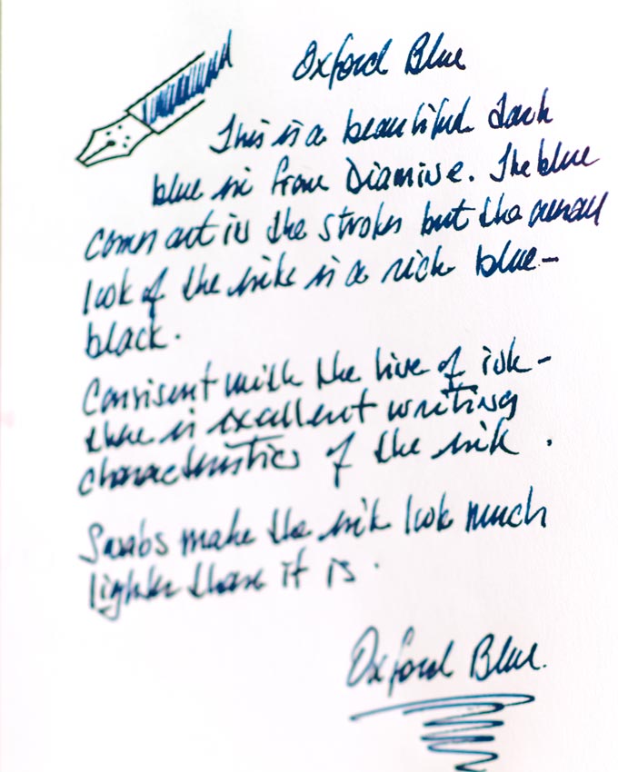
Oxford Blue
Eau de Nil
I find this ink to come across as a very dark blue, one with the look of the blue-black group of inks. Some of the line strokes, for example those within the pen graphic show the beautiful blue of this ink. But as I write with it, the darker tone seems to be more prominent. That may be a consequence of the weight that I place on the pen when I write.
Consistent with the Diamine line of inks, this ink has excellent flow, no feathering and some shading depending on the nib used. The broader the nib then some of the strokes show shading. But overall with my writing, there is no significant shading present.
Ink swabs bring out the lighter blue, but the real test of the ink is how it looks coming off a nib.